

Updating the notch
From version 1 to 2 there are many improvements, some were major while others were fairly minor. The lower case b and u for example, received only some minor updates while the lower case g and s have changed quite dramatically.
One of the updates that I wanted most was the notch itself. I wanted a more consistent sized and strategically placed notch on each character. On top of that I also wanted to improve the overall weight because it felt weak and inconsistent from character to character. I also refined the x-height, over shoots, serifs, and a myriad of other details. All of which have dramatically made Notch a much stronger and more coherent font family.
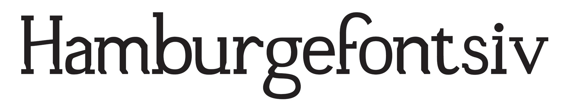
Notched Version 1.
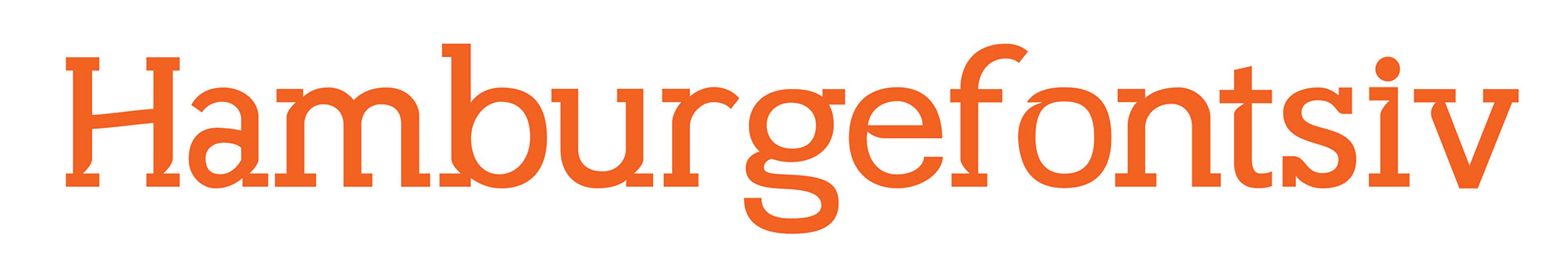
Notched Version 2.
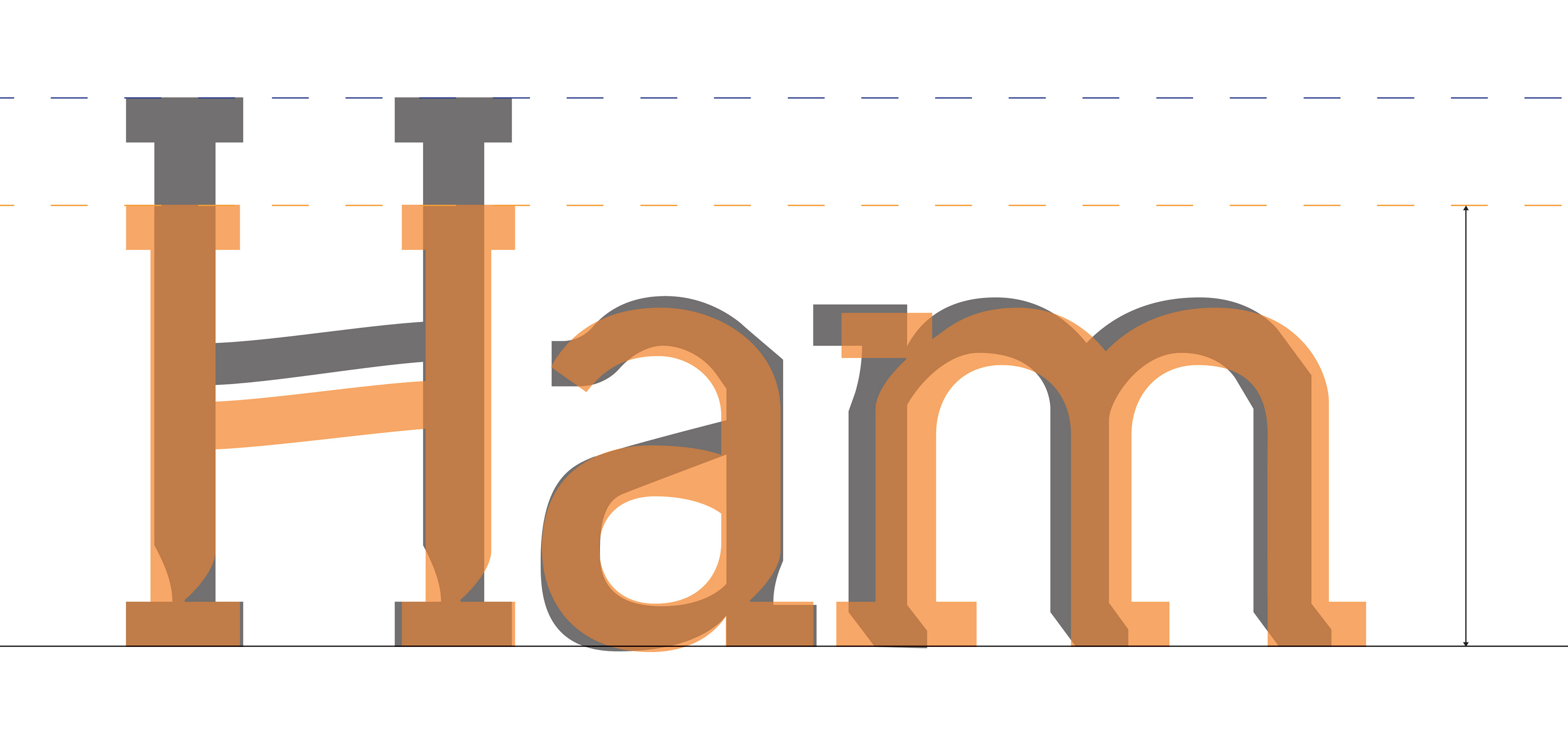
Lowered cap height, heavier weight, and wider characters provide a stronger and more readable text